CSS Clamp Generator

Generate responsive CSS clamp() values for type, spacing, and layout with real viewport ranges instead of hand-calculating the math.

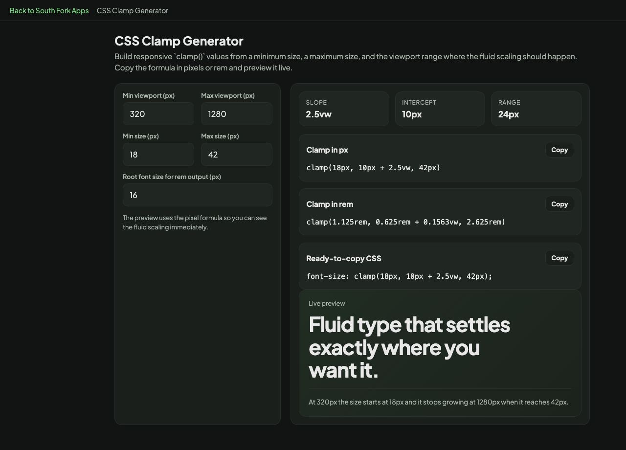
The preview uses the pixel formula so you can see the fluid scaling immediately.

Slope
0vw
Intercept
0px
Range
0px
Clamp in px
Clamp in rem
Ready-to-copy CSS
Live preview
Fluid type that settles exactly where you want it.
Why people use this tool

CSS Clamp Generator

Generate responsive CSS clamp() values for type, spacing, and layout with real viewport ranges instead of hand-calculating the math.

  • Create fluid type scales between mobile and desktop breakpoints.
  • Set responsive padding, gaps, and margins without extra media queries.
  • Copy the finished clamp() line straight into a component stylesheet.
Typical workflow Enter the small and large values you want, define the viewport range, then copy the resulting clamp() declaration.
CSS Clamp Generator interface preview
Live interface preview for CSS Clamp Generator. This screenshot is also the landing image Google can associate with the tool page.