CSS Code
About this tool
CSS Box Shadow Generator
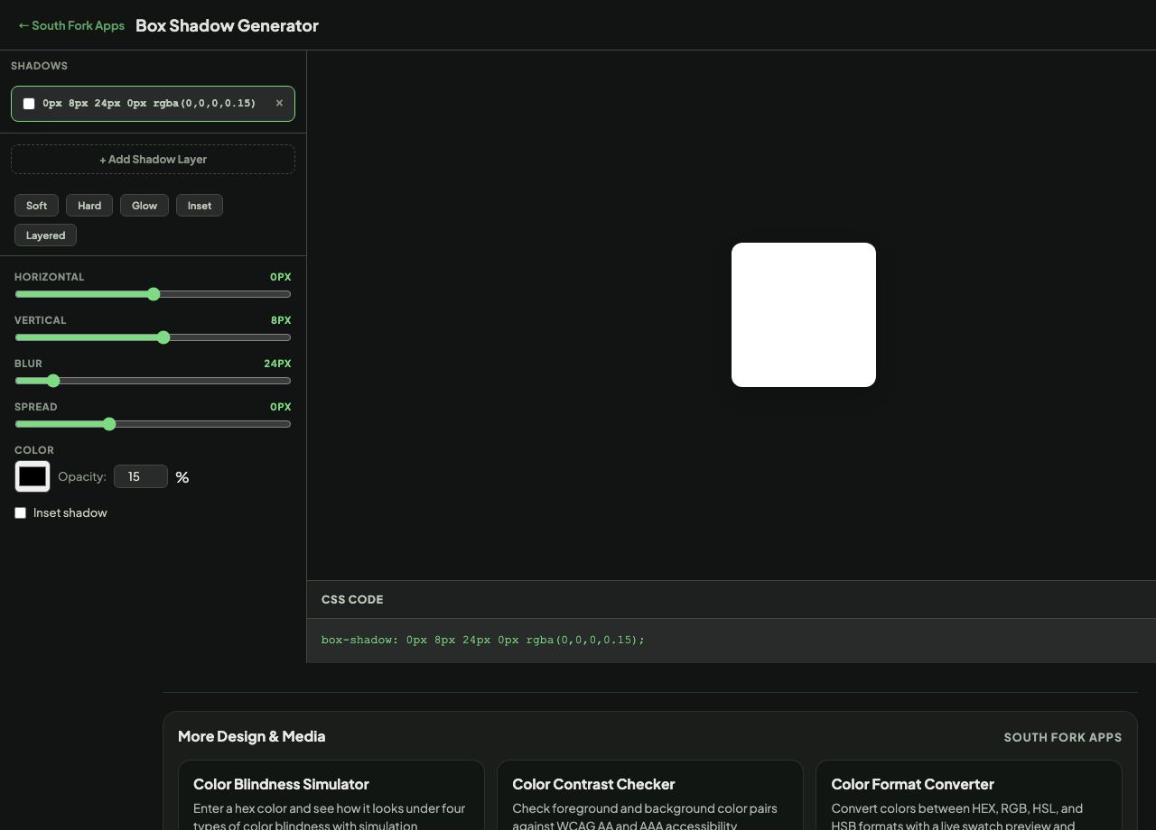
Box Shadow Generator builds CSS shadows visually, letting you stack multiple layers and adjust offset, blur, spread and colour with a live preview.
How to use it
- Adjust the horizontal and vertical offset, blur and spread.
- Add more layers to build depth.
- Copy the generated box-shadow value.
Why one shadow rarely looks right
The box-shadow syntax is offset-x, offset-y, blur, spread, colour, with an optional inset keyword. A single shadow with a large blur produces the soft grey halo that reads as generic and slightly cheap.
Real shadows are layered. Combining a tight, darker shadow with a wider, softer one imitates how light actually falls, giving a close contact shadow plus ambient occlusion. That is what separates a considered elevation system from a default drop shadow.
When it helps
- Building an elevation scale for cards and modals.
- Creating a focus ring using spread with no blur.
- Making an inset shadow for a pressed or recessed control.
- Matching a shadow from a design handover.
Common mistakes
- Using pure black at high opacity. Shadows read better as a dark, desaturated version of the background hue at low opacity.
- Offsetting horizontally. Most interface lighting is modelled from directly above, so vertical offset alone usually looks more natural.
- Stacking many large blurred shadows, which is a real rendering cost on long lists.