About this tool
Color Contrast Checker
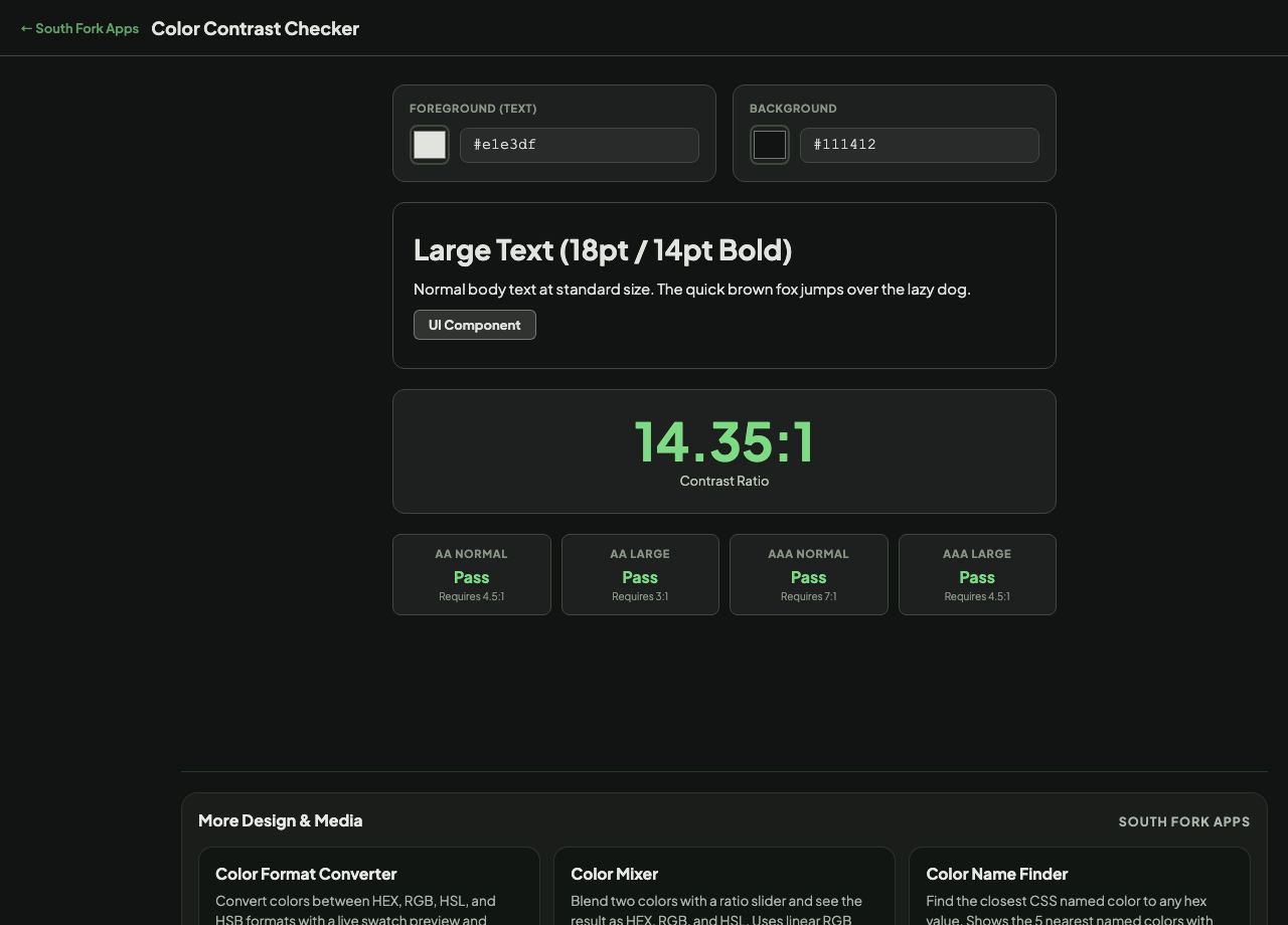
Color Contrast Checker measures the contrast ratio between a foreground and background colour and tells you whether it passes WCAG AA and AAA at normal and large text sizes.
How to use it
- Set the foreground (text) colour with the picker or by typing a hex value.
- Set the background colour the same way.
- Read the ratio and the pass or fail result for each WCAG level.
What the thresholds actually are
Contrast ratio runs from 1:1 (identical colours) to 21:1 (pure black on pure white). It is computed from the relative luminance of the two colours, not from how different they look, which is why two vivid colours can be visually distinct and still fail.
WCAG AA requires 4.5:1 for normal text and 3:1 for large text, where large means at least 18pt, or 14pt bold. AAA raises those to 7:1 and 4.5:1. Interface components and meaningful graphics need 3:1 against their surroundings.
Worked example
Common results:
- Black on white21:1, passes everything
- Mid grey #767676 on white4.54:1, just passes AA normal
- Light grey #999999 on white2.85:1, fails AA at any size
Result: The popular light-grey-on-white look for secondary text fails AA, which is why so many redesigns get accessibility complaints.
When it helps
- Checking a colour pair before committing it to a design system.
- Fixing an accessibility audit finding.
- Choosing a text colour that works on a brand background.
- Testing placeholder and disabled states, which are usually the worst offenders.
Common mistakes
- Testing only body text. Buttons, form borders and icons carry their own 3:1 requirement.
- Assuming a large ratio means readable. Contrast is necessary but does not fix a tiny font or a bad typeface.
- Testing against the wrong background. Text over an image or a gradient has to pass against the worst part of it.