About this tool
CSS Clamp Generator
CSS Clamp Generator produces a fluid clamp() value from a minimum and maximum size and the viewport range they should scale across, so type and spacing grow smoothly instead of jumping at breakpoints.
How to use it
- Set the minimum and maximum viewport widths you are designing between.
- Set the size you want at each end.
- Adjust the root font size if it is not the default 16px.
- Copy the generated clamp() value.
How clamp() interpolates
clamp() takes three values: a minimum, a preferred, and a maximum. Below the minimum viewport the value stays fixed at the minimum, above the maximum it stays fixed at the maximum, and between them the preferred value scales linearly.
The preferred value has to be built from a rem offset plus a vw multiplier, which is the linear equation running through your two points. Getting that arithmetic right by hand is fiddly, which is the entire reason this tool exists.
Worked example
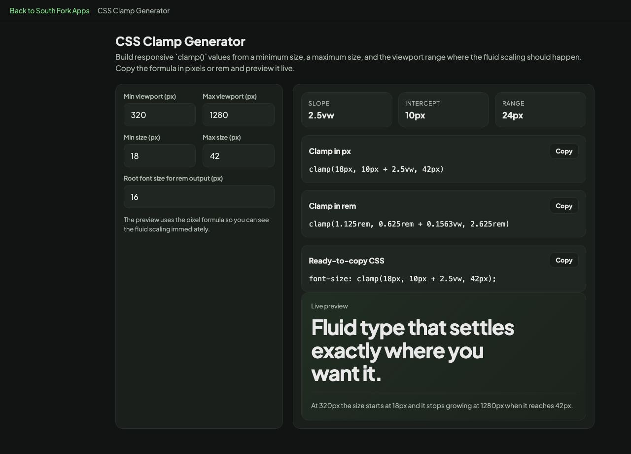
Fluid heading type with the default values:
- Viewport range320px to 1280px
- Size range18px to 42px
Result: 18px at phone width, growing smoothly to 42px at 1280px, then holding steady above that.
When it helps
- Fluid typography that scales without breakpoints.
- Responsive spacing and padding that grows with the viewport.
- Container widths that adapt between two known bounds.
- Removing a stack of media queries that only changed a font size.
Common mistakes
- Using a pure vw preferred value with no rem component. That breaks browser zoom, because the text no longer responds to the user's font size setting, which is a genuine accessibility failure under WCAG.
- Setting the minimum too small. Text below about 16px on mobile is hard to read regardless of how elegantly it scales.
- Applying clamp everywhere. Fixed values are fine for anything that does not need to scale, and clamp makes the CSS harder to read.