CSS Filter Generator
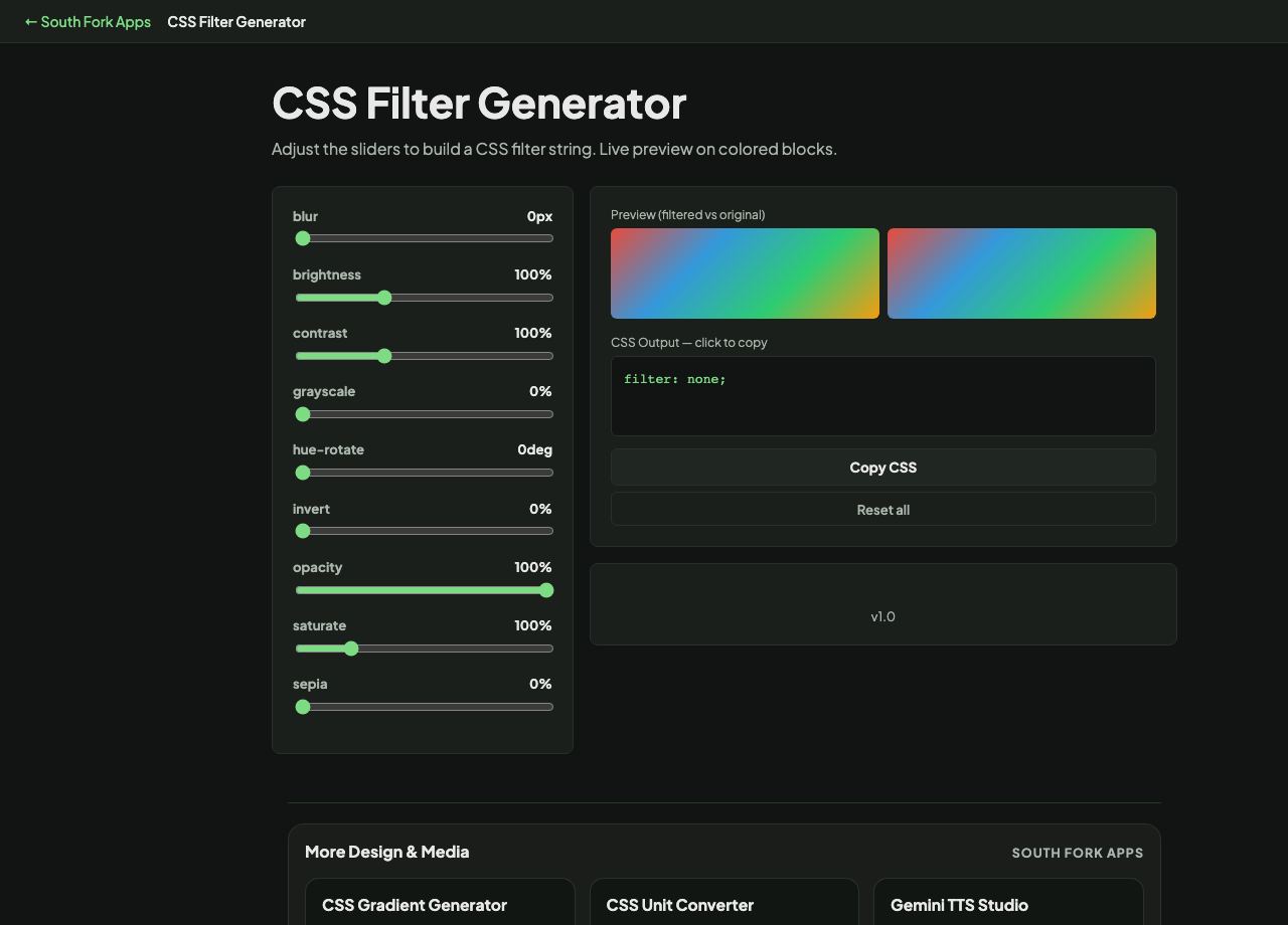
Adjust the sliders to build a CSS filter string. Live preview on colored blocks.
Preview (filtered vs original)
CSS Output — click to copy
About this tool
CSS Filter Generator
CSS Filter Generator builds a filter string with sliders for blur, brightness, contrast, grayscale, sepia, hue-rotate, saturate, invert and opacity, with a live preview.
How to use it
- Adjust the sliders for the effects you want.
- Watch the preview update.
- Copy the generated filter value.
Filters apply in order
The filter property takes a list of functions applied left to right, and the order changes the result. Blurring then increasing contrast is not the same as increasing contrast then blurring, because each operates on the output of the last.
Filters are also relatively expensive to render, particularly blur. Applying one to a large element, or animating it, can cost real frame rate on lower-powered devices.
When it helps
- Dimming or desaturating an image behind text.
- Creating hover effects on images without producing separate files.
- Building a disabled state by desaturating and reducing opacity.
- Adjusting an image's appearance without editing the file.
Common mistakes
- Animating blur. It is one of the most expensive filters and is a common cause of janky animation.
- Using filters to fix a badly exposed image. Editing the source file gives a better result at no runtime cost.
- Forgetting that filter applies to the whole element including its children and text.