← South Fork Apps

CSS Unit Converter


px

px

px
About this tool

CSS Unit Converter

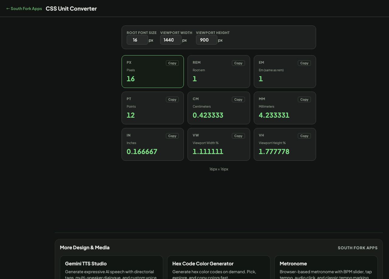
CSS Unit Converter translates between px, rem, em, vw, vh, pt and cm, using the root font size and viewport dimensions you specify.

How to use it

  1. Set the root font size, and the viewport width and height you are designing for.
  2. Enter a value in any unit.
  3. Read the equivalents.

Which unit to reach for

px is absolute. rem is relative to the root font size, which defaults to 16px but changes if the user has increased their browser's base font size. em is relative to the parent element's font size, which is why nested em values compound and become hard to predict.

The accessibility argument favours rem for font sizes and spacing, because a reader who has raised their default font size gets a proportionally larger layout. Viewport units scale with the window and ignore that setting entirely, which is why pure vw typography is an accessibility problem.
When it helps

  • Converting a design handed over in pixels into rem for implementation.
  • Working out what a rem value resolves to at a given root size.
  • Checking how a viewport unit behaves at a specific screen width.
  • Converting print units for a stylesheet that targets paper.

Common mistakes

  • Using em for font sizes in nested components, where the compounding produces sizes nobody intended.
  • Sizing text in pure vw, which breaks user font scaling.
  • Assuming the root font size is always 16px. It is the default, not a guarantee.
CSS Unit Converter interface preview
Screenshot of the live CSS Unit Converter interface.

v1.0