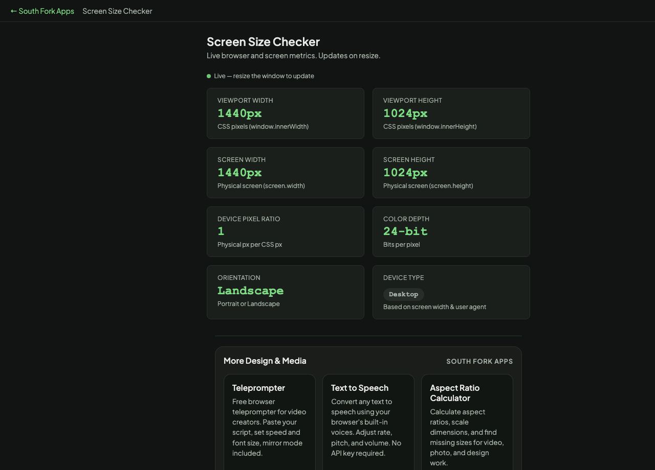
Screen Size Checker
Live browser and screen metrics. Updates on resize.
Live — resize the window to update
Viewport Width
—
CSS pixels (window.innerWidth)
Viewport Height
—
CSS pixels (window.innerHeight)
Screen Width
—
Physical screen (screen.width)
Screen Height
—
Physical screen (screen.height)
Device Pixel Ratio
—
Physical px per CSS px
Color Depth
—
Bits per pixel
Orientation
—
Portrait or Landscape
Device Type
Based on screen width & user agent
About this tool
Screen Size Checker
Screen Size Checker reports your browser viewport, screen resolution, device pixel ratio and related display values, updating live as you resize.
How to use it
- Open the page and read the values.
- Resize the window to watch the viewport figures change.
Viewport, screen and device pixel ratio
Screen resolution is the whole display. Viewport is the area your page actually gets, which is smaller because of browser chrome, and it is the number that matters for CSS media queries.
Device pixel ratio is the multiplier between CSS pixels and physical device pixels. A ratio of 2 means each CSS pixel is drawn with four physical pixels, which is why images need to be supplied at twice the nominal size to look sharp on those screens.
When it helps
- Finding your real viewport size when debugging a media query.
- Checking device pixel ratio to work out what image resolution to supply.
- Confirming what a device actually reports, rather than trusting a spec sheet.
- Testing responsive breakpoints by resizing and watching.
Common mistakes
- Designing breakpoints around screen resolution instead of viewport width.
- Supplying single-resolution images and wondering why they look soft on modern phones.
- Assuming the viewport is stable on mobile. Browser toolbars appear and disappear on scroll, changing the visible height.